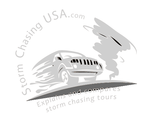
When I remade StormChasingUSA.com my plan was to improve every part of the site, including the logo. The logo was changed but I was never really satisfied with it. I am no designer and the current one (below) was only meant to be something temporary. I mean, it’s ok but it really look like it was made in Photoshop in like 5 minutes (which is pretty much the case):
Now, I have finally taken the time to focus on making a new logo. Well, in fact, hiring my incredibly talented illustrator Vineta to create one for me. It is not yet done but we are getting somewhat close. It would be great to hear some feedback on it!
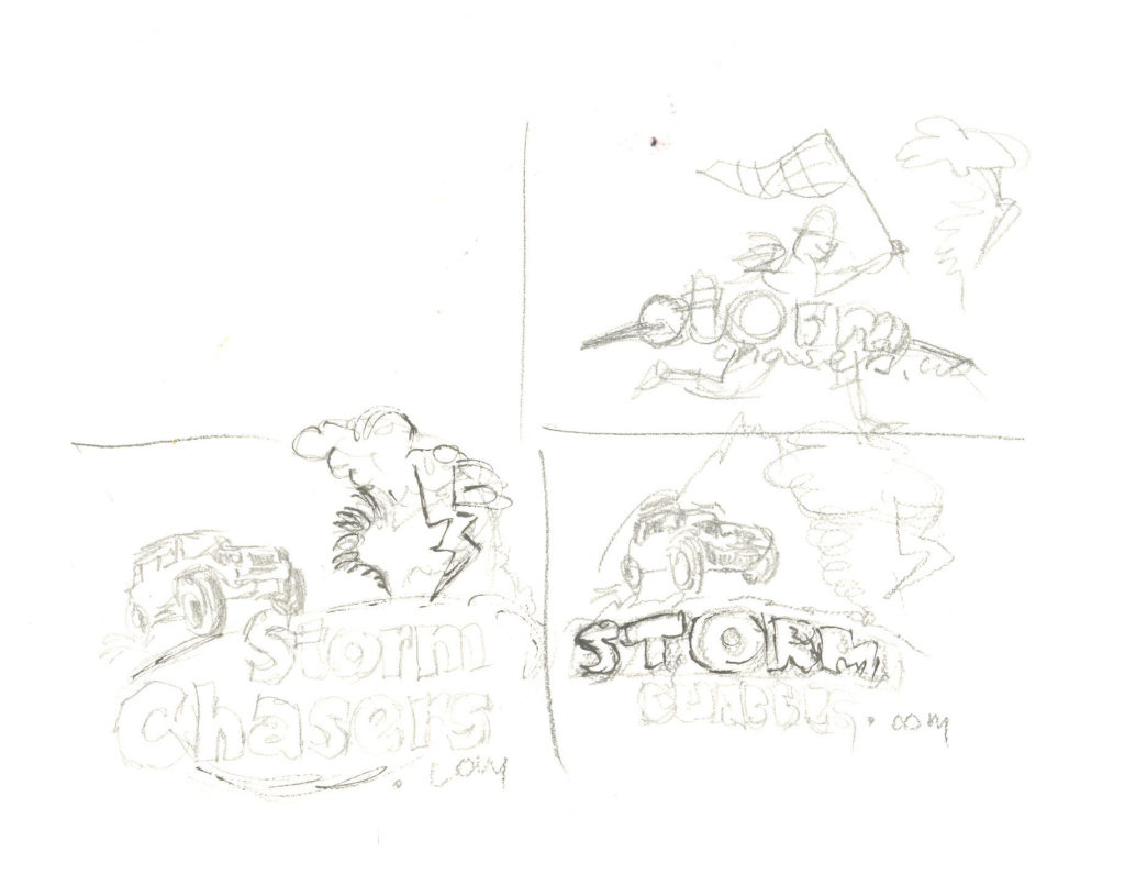
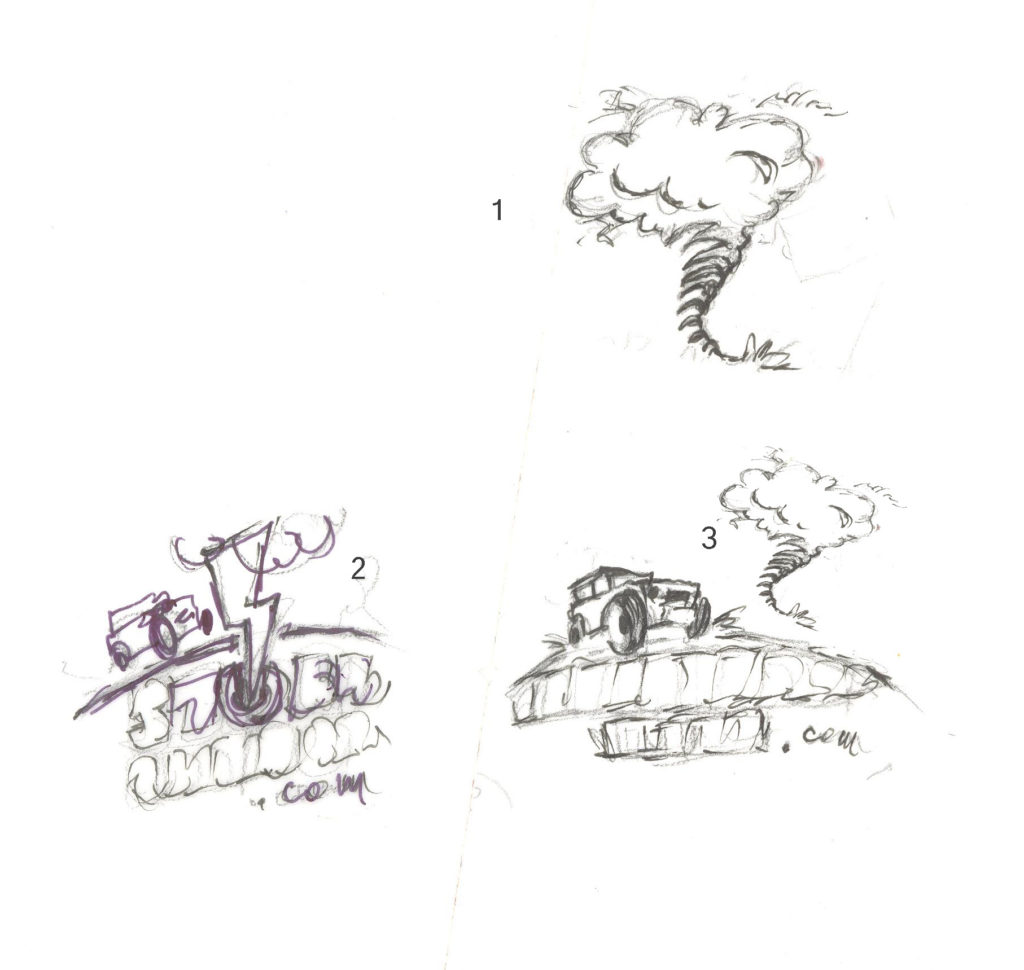
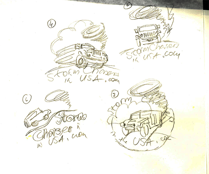
Below are a few of the sketches she has provided me with. They are just rough ideas of how the logo could look based on my suggestions to include a chaser, a tornado and/or lightning together with “StormChasingUSA.com” (which was misunderstood in some of the samples, the website is not changing name to stormchasers.com).
Out of these I really liked the #4 and #7. Sample #4 had a really cool motion in it and it made sense. Sample #7 had was visually very pleasing and I like the circular shape of it. The latter one did not make much sense though since the vehicle is driving away from the tornado.
What do you think?
